Case study
BookEvents Africa - Streamlined Ticket Booking
A comprehensive ticketing solution that enhances the attendee experience while simplifying event management for organizers.
Overview
The landing page is often the first point of interaction for potential customers, making it a critical element in the user journey. For this project, the goal was to redesign the page to better communicate the platform's value proposition, guide users toward key actions, and introduce an 'Explore' page to help users easily discover events.The new design aimed to be more visually appealing, user-friendly, and optimized for conversions, encouraging visitors to explore and organize events.
The Challenge
The existing landing page was underperforming in terms of user engagement and conversion rates. Key issues included:
- Cluttered design: Information was presented in a disorganized manner, overwhelming users and making it difficult for them to quickly understand the platform's core offering.
- Poor navigation: Users struggled to find relevant events or easily access ticketing options, leading to frustration and high bounce rates.
- Low mobile optimization: The page wasn't fully optimized for mobile devices, causing slow load times for users on smartphones and tablets.
Design Solution
- Simplified layout: A cleaner, more organized design that highlights the key features of the platform and immediately communicates the value proposition. The new layout uses whitespace effectively to reduce visual clutter and guide the user's focus.
- Intuitive navigation: Introduced an easy-to-use navigation bar with quick access to categories like "Explore Events" and "Sign Up." Users can now quickly find events that match their interests.
- Mobile-first design: The page was fully optimized for mobile, with a responsive design that ensures fast load times, easy navigation, and consistent user experience across all screen sizes.
- Enhanced visual design: Leveraged high-quality imagery to showcase popular events, integrated into a visually appealing and cohesive layout. This approach not only captures the user's attention but also builds trust in the platform's offerings.
The Old Landing Page
The old landing page design was very hard for users to navigate because it had a lot of information crammed into one place. Users had trouble finding what they needed quickly, and the many competing elements made it hard to know where to focus. This confusion led to higher bounce rates and fewer ticket purchases, as users couldn't easily figure out what to do next.
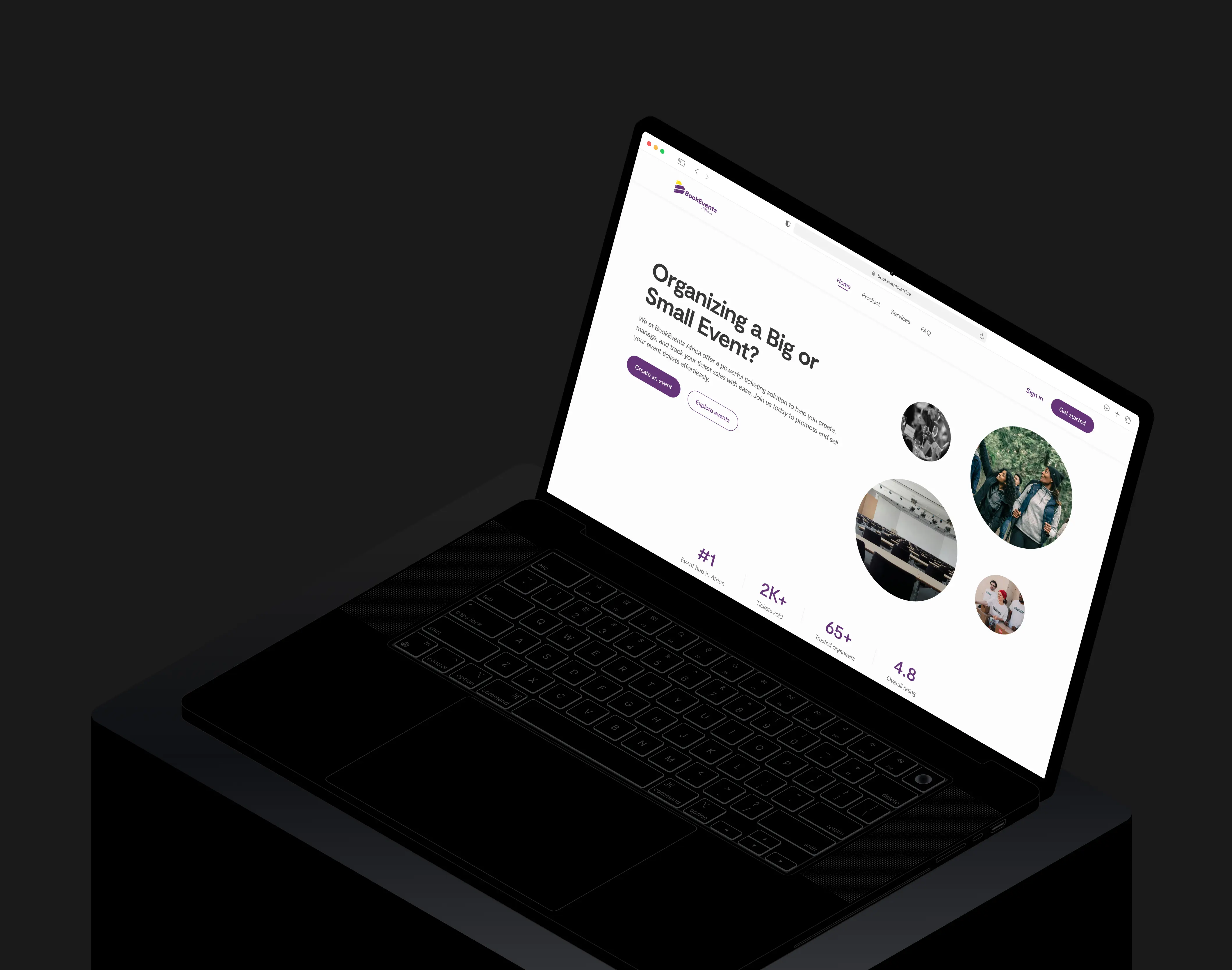
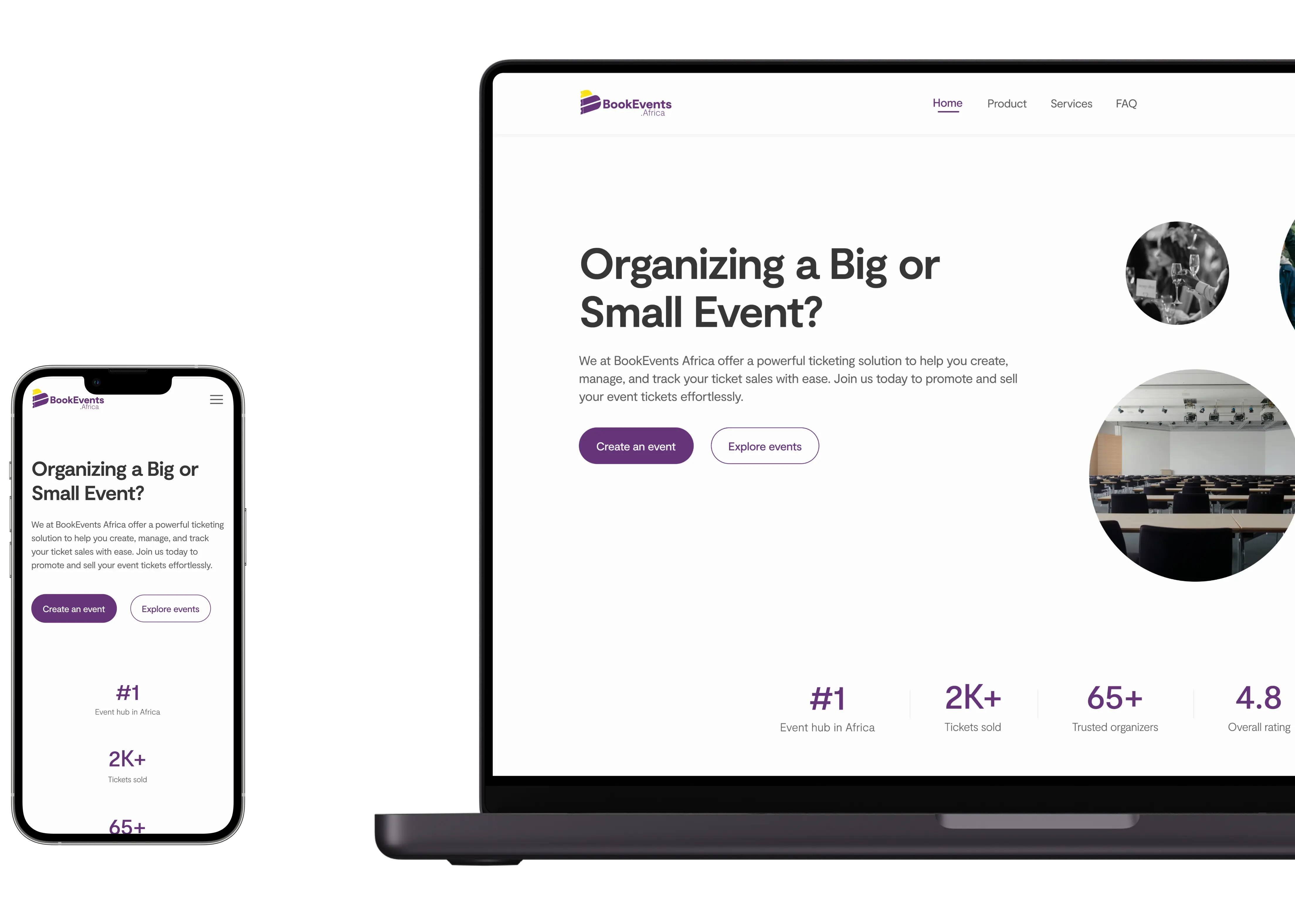
The New Landing Page
The new landing page design offers a much cleaner and more user-friendly experience. The layout was simplified to highlight key information and made it easier for users to find what they're looking for. By reducing clutter and focusing on clear calls to action, the page now guides visitors seamlessly —whether it's exploring events or organizing an event. With a more intuitive structure, the new design makes navigation quicker and more enjoyable, leading to better engagement and higher conversions.
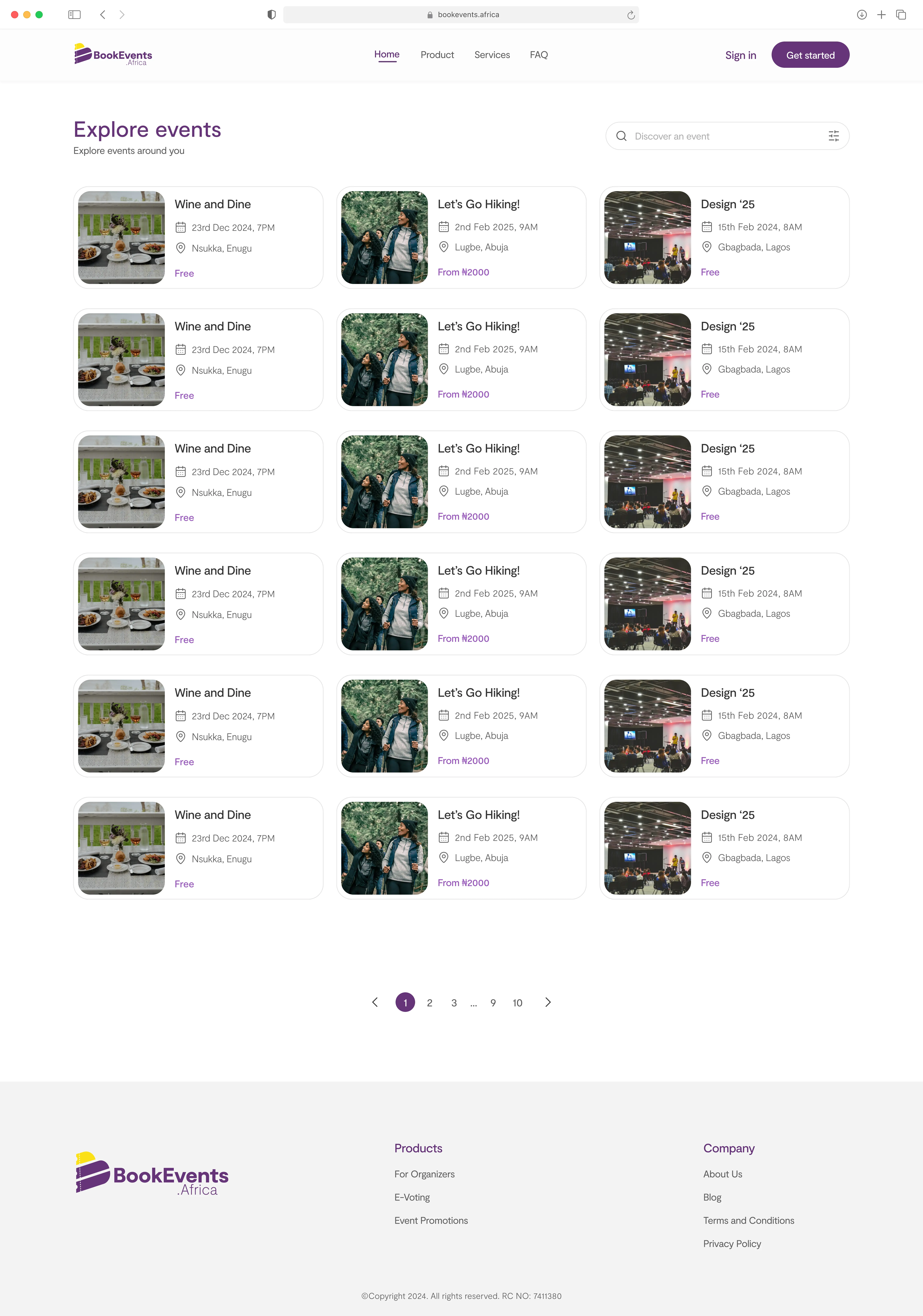
Explore Page
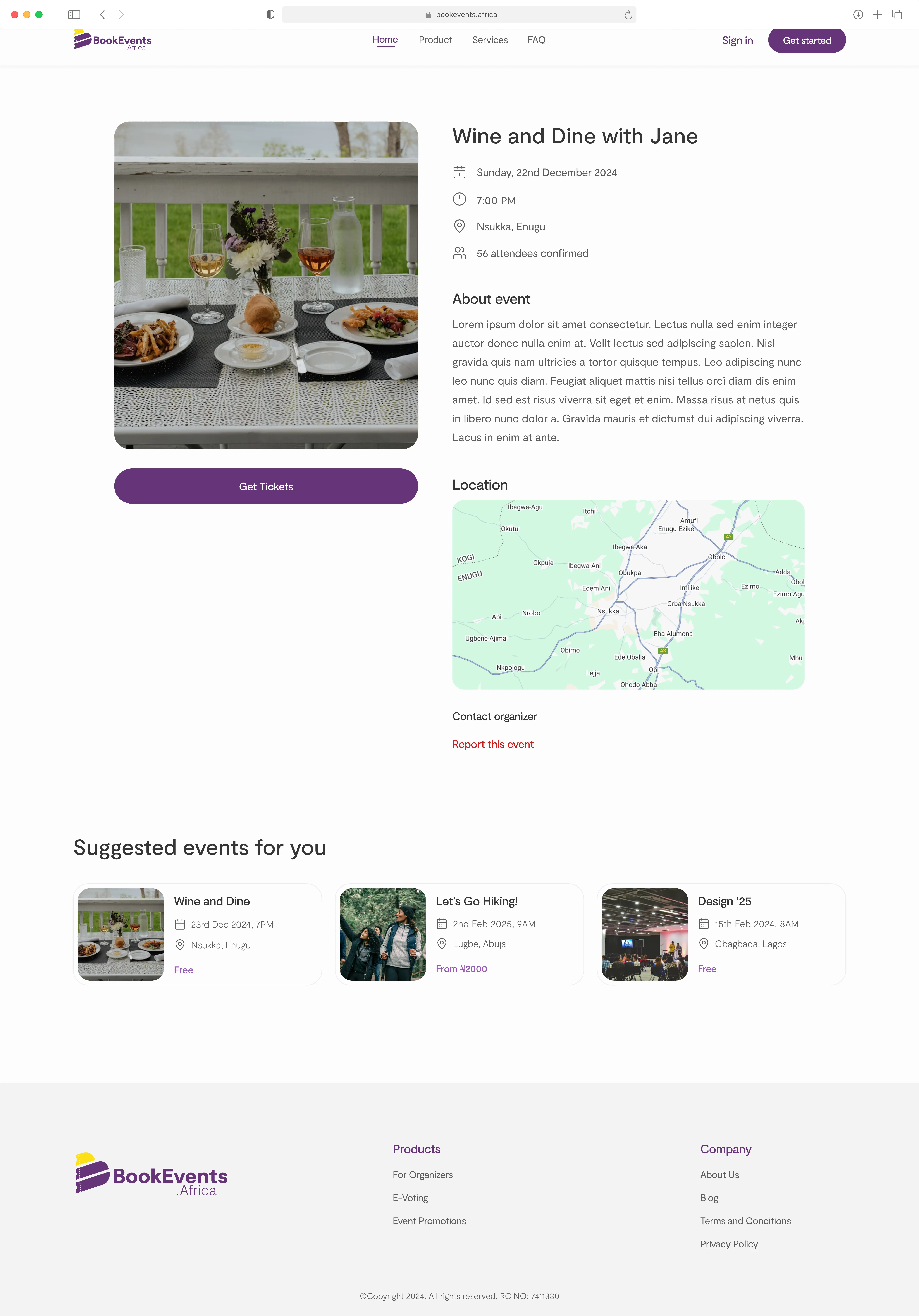
To enhance user experience and simplify event discovery, we extracted the 'Events' section from the main landing page and created a dedicated 'Explore' page. This new page serves as a central hub where users can easily browse through various events, filter by categories or location, and access detailed information. By organizing events in a more intuitive, accessible way, the 'Explore' page not only makes it easier for attendees to find events that match their interests, but also streamlines the ticket purchase process.
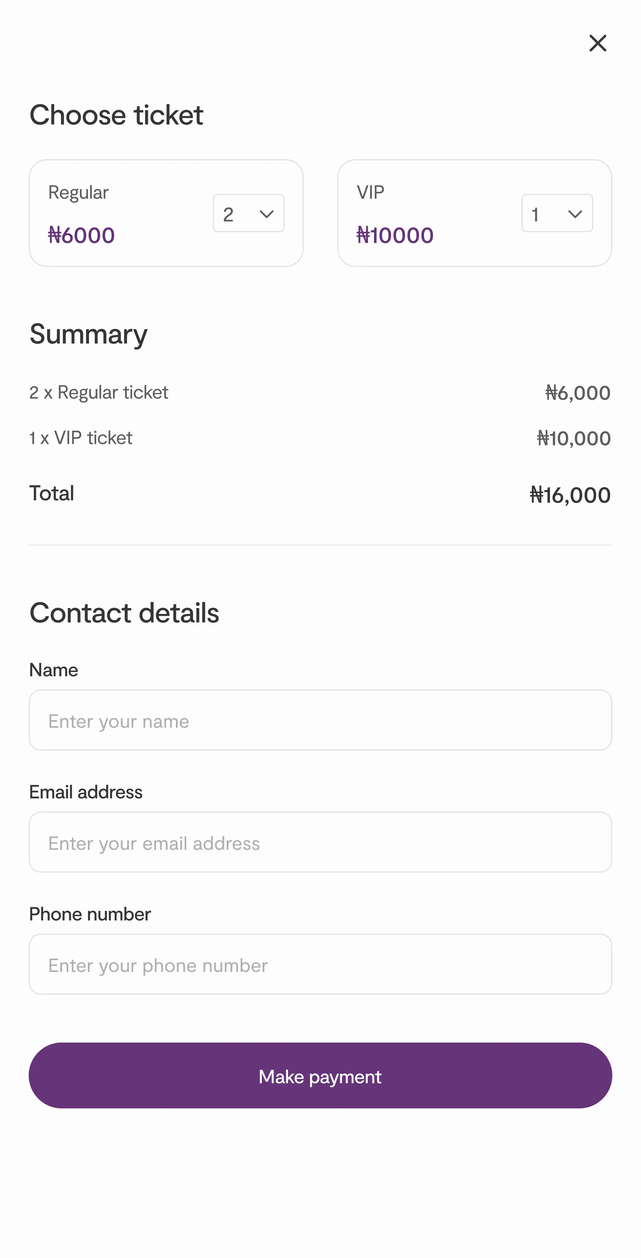
Event Details & Ticketing Modal
We opted for a modal instead of redirecting users to a separate page to streamline the ticket purchase process. This approach minimizes friction by keeping users on the same page, avoiding the disruption of redirects, and allowing them to quickly and easily purchase tickets without losing context or navigation flow.
Impact
- Increased conversion rates: The new landing page design led to a 25% increase in ticket purchases, as users were able to navigate the page more easily and find what they were looking for.
- Reduced bounce rate: Simplifying the layout and improving page load speeds resulted in a 30% reduction in bounce rate, indicating that users were staying on the site longer and engaging with more content.
Learning
- Mobile optimization is non-negotiable: Mobile-first design isn't just a trend; it's a requirement. A significant portion of our users access the platform via mobile, and ensuring a smooth, fast, and intuitive mobile experience led to improved engagement.
- Effective CTAs require clear visibility: Placement and design of CTAs directly impacted conversion rates. By testing different button texts and placements, we saw that making CTAs more prominent and actionable significantly boosted click-through rates.
- User trust is built through visuals: High-quality imagery and clean, professional design elements helped establish trust and reliability while telling a compelling brand story, which is critical in the event ticketing industry.
Next project:

-05cec205.webp)

-c2aae565.png)
-a7cdd8f1.webp)
-b21ee1c1.webp)
-a60ab536.webp)
